21 Days Prayer Experience

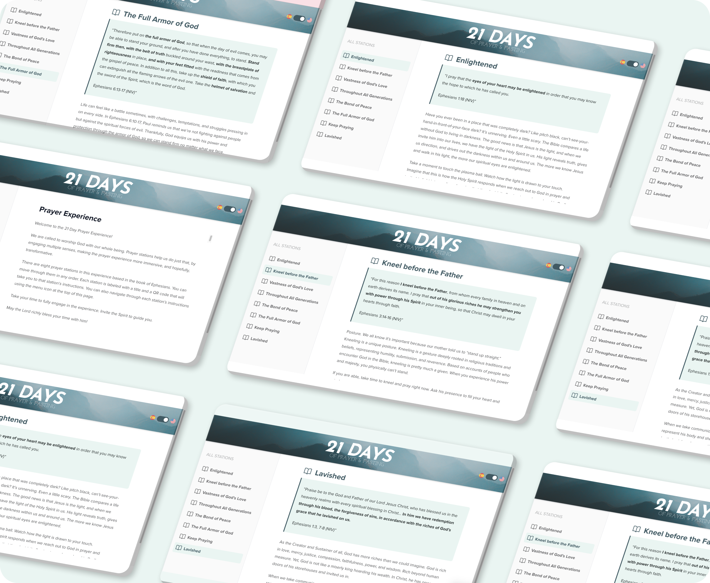
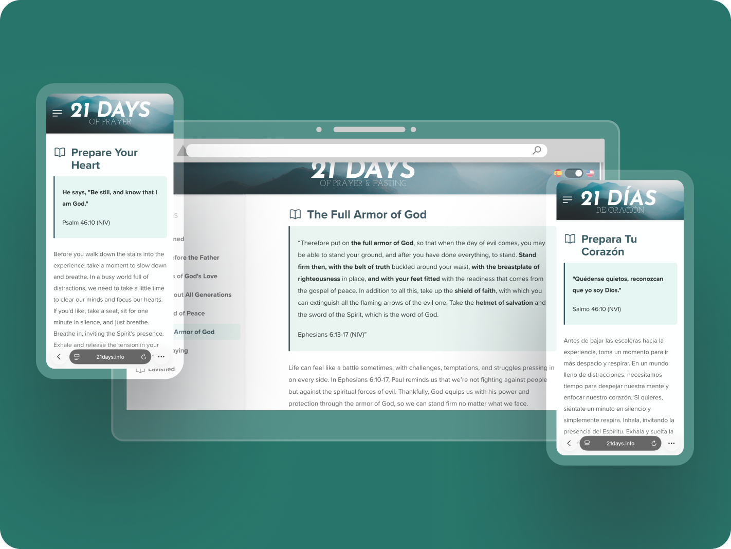
The Prayer Experience website underwent a complete redesign to enhance user engagement, streamline navigation, and improve multilingual accessibility. This case study highlights key changes made to the website, comparing the “Before” and “After” states while showcasing the impact on the overall user experience.

Task

Resolve poor navigation and content readability by redesigning the interface to provide clearer structure, better wayfinding, and a more immersive reading experience across web and mobile.
  • Client

    21days

  • Project Type

    Website Redesign

  • Role

    UX Designer, Frontend Developer

  • Tools

    VS Code, Figma, Chrome DevTools

  • Technologies

    Next.js, TypeScript, Tailwind CSS, Typography Plugin, Markdown, gray-matter, markdown-it

  • Focus

    Navigation, Layout, Typography, Multilingual UX

  • Tags

    Figma, Next JS, React JS, UI Design, UX Design

Open Project
Challenges

Key UX and Structure Issues in the Original Website

Before the redesign, the Prayer Experience website had several usability, navigation, and layout issues that made the experience difficult to follow, especially during a guided prayer flow. The goal was to identify the main friction points and improve the structure, readability, and navigation while keeping the existing Markdown-based content system intact.

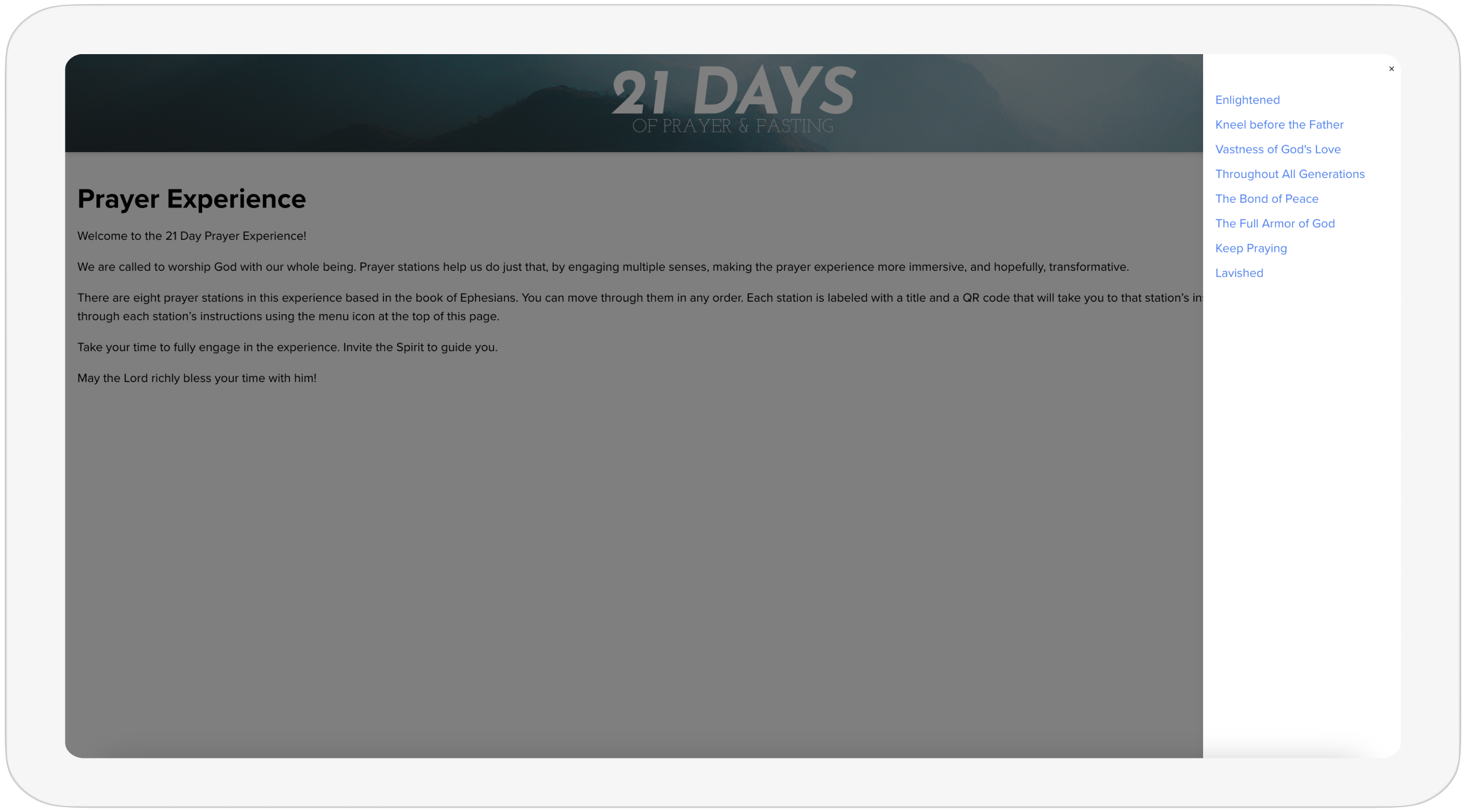
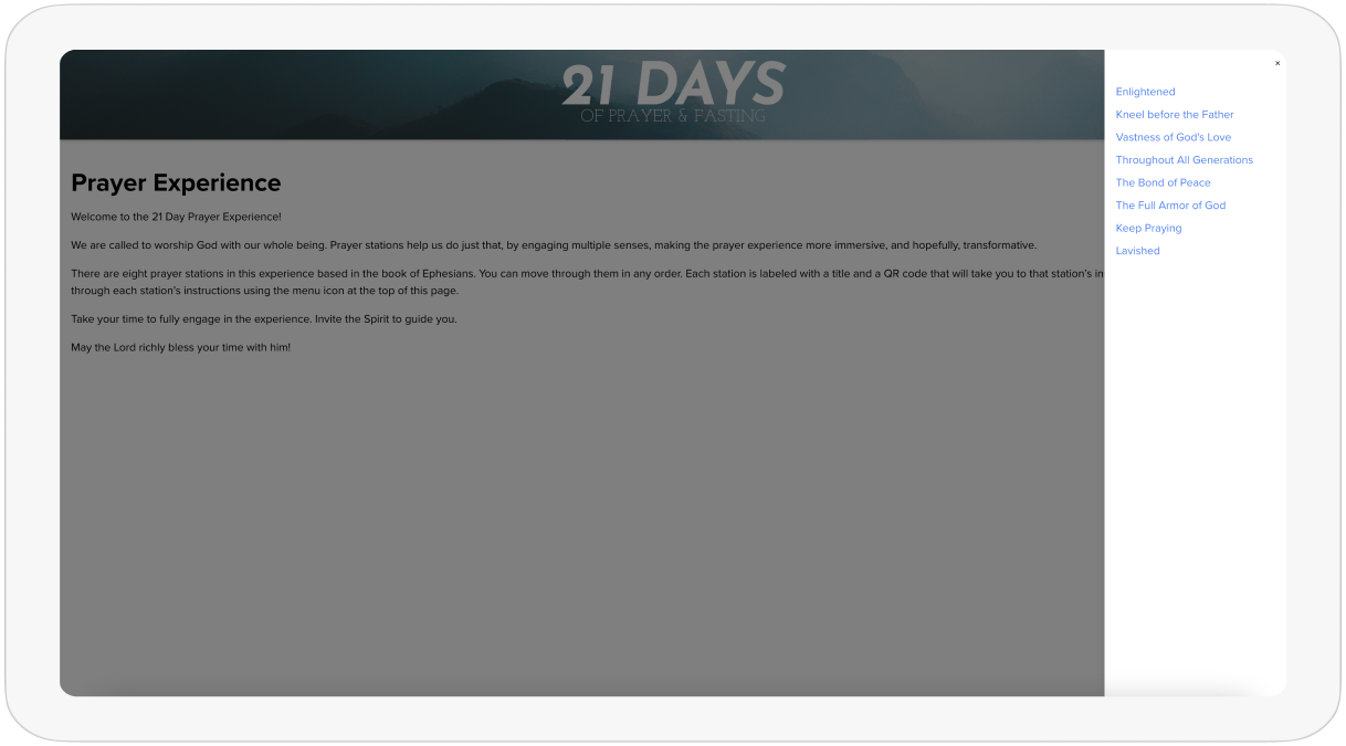
Navigation Menu

Unclear Navigation Structure

Users struggled to locate prayer station instructions because the navigation menu was hidden behind a menu button. Switching between stations required multiple clicks, making the experience slow and less intuitive, especially on desktop.

Layout / Content Container

Poor Content Structure and Full-Width Layout

The content spanned the full width of the screen, creating excessive white space and making long text difficult to read. The lack of a structured content container reduced visual clarity and made the instructions harder to follow, especially on larger screens.

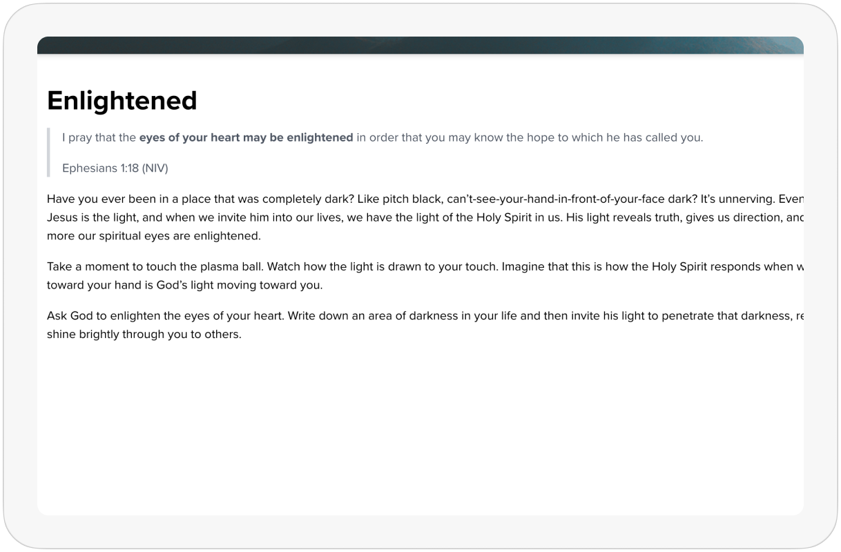
Visual Design / Typography

Outdated and Inconsistent UI

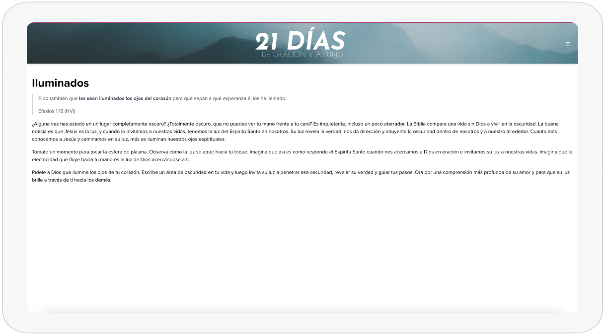
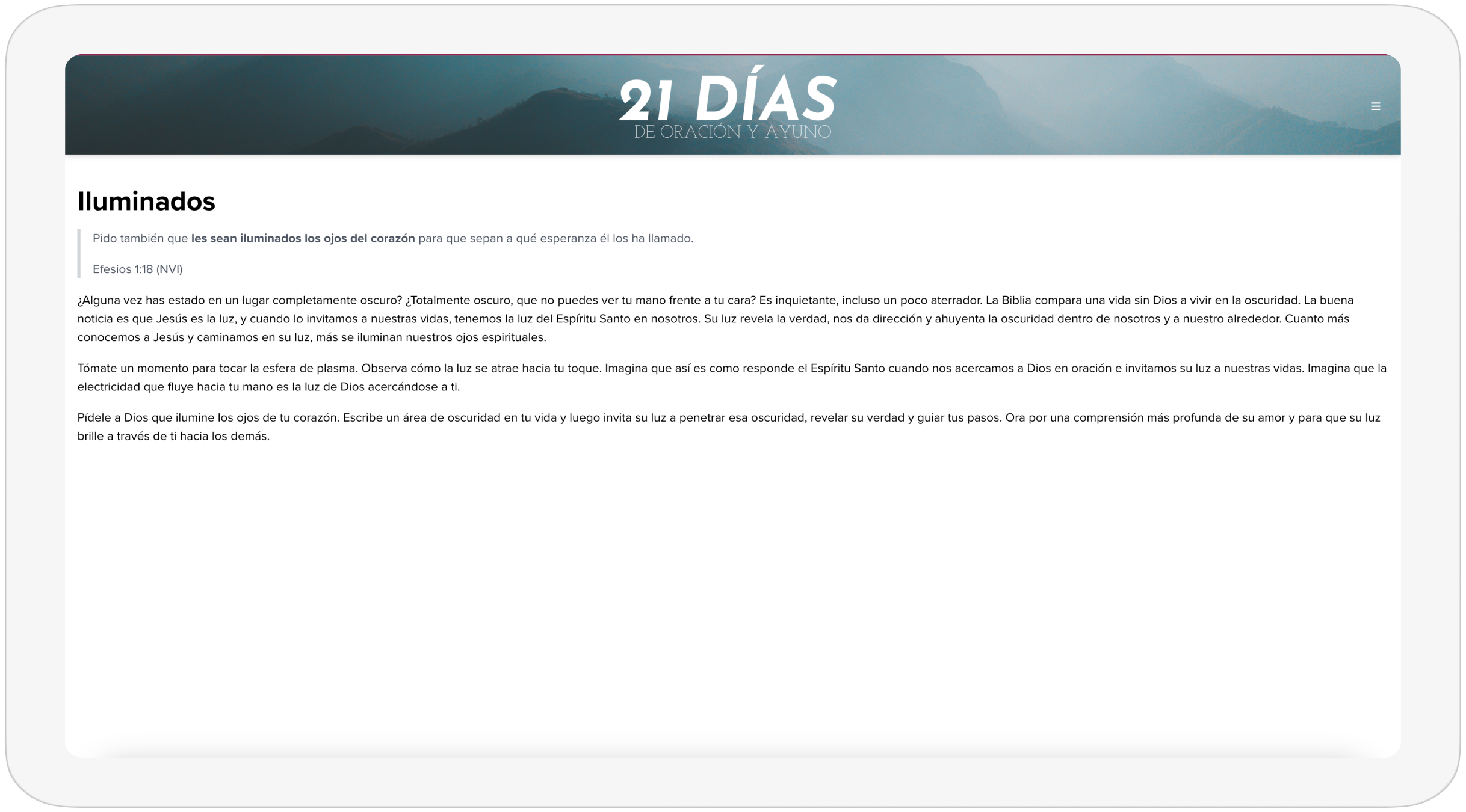
The site rendered content without proper typography styling. Headings, spacing, and lists lacked visual hierarchy, making the pages feel dense and outdated. This reduced readability and made the content harder to engage with.

Language Switcher / Localization

No Language Switcher in the Interface

The site did not include a visible language switcher. Users had to manually modify the URL in the address bar to change between English and Spanish pages. This created confusion and interrupted the guided prayer experience.

Solutions

Key Improvements in the Redesigned Experience: Before vs. After

After identifying the main usability and layout issues, the website was redesigned to improve navigation, readability, multilingual support, and overall structure while keeping the existing Markdown-based content system.

The updates focused on creating a clearer layout, reducing user effort, and making the experience more immersive across web and mobile.

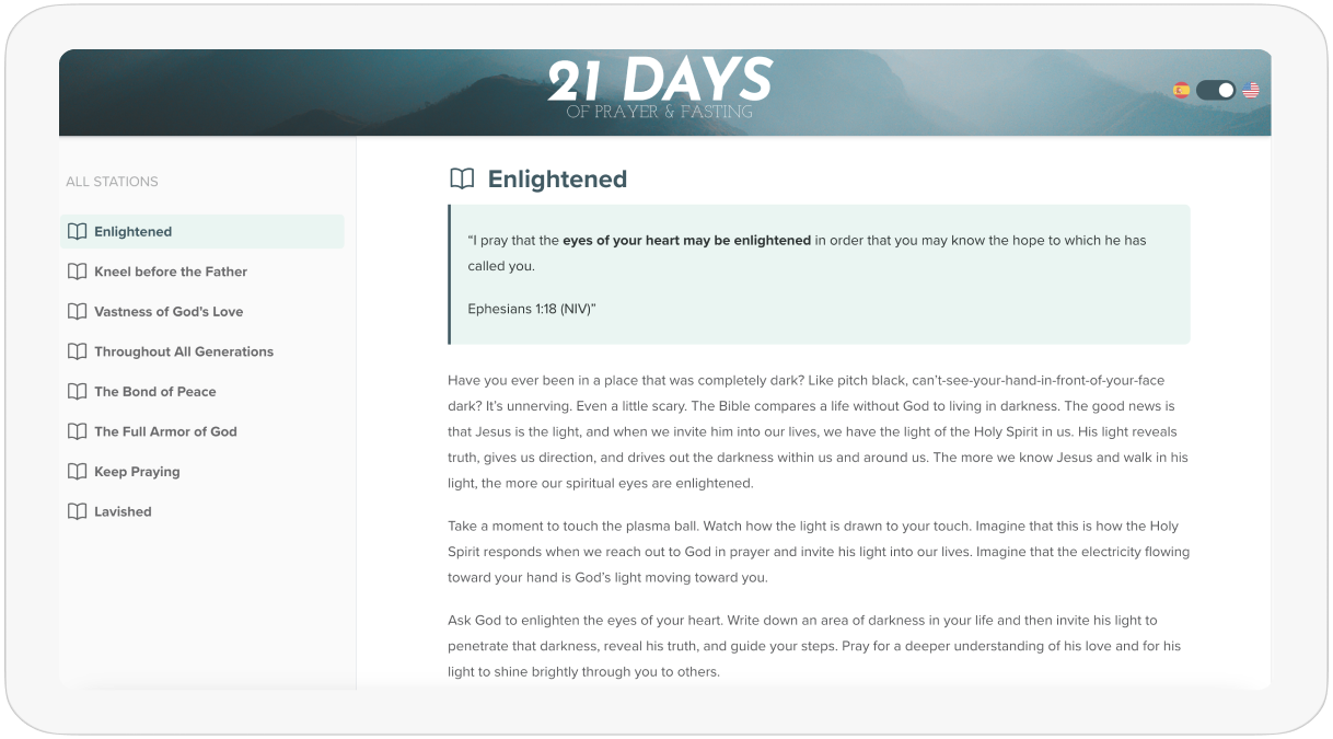
Improvement 1: Content Styling

Improved Markdown Styling with Tailwind Typography

Before

  • Markdown content rendered without proper typography styles.

  • Pages looked text-heavy and lacked hierarchy.

  • Layout felt outdated and difficult to read.

  • Content was parsed using gray-matter and markdown-it, but had no design styling.

  •  

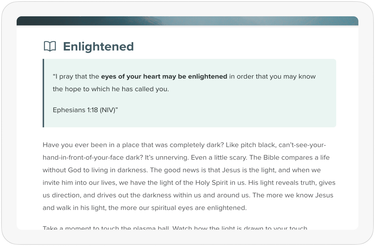
After

  • Installed the Tailwind CSS Typography plugin.

  • Used prose classes to style already-rendered Markdown content.

  • Added proper spacing, heading styles, and readable line width.

  • Resulted in a clean, modern, minimal content design without changing the content structure.
  •  
Before After
Improvement 2: Navigation / Layout

Sidebar Navigation for Better Structure on Desktop

Before

  • Navigation between prayer stations was hidden behind a menu button.

  • Users had to open the menu every time to switch stations.

  • Content stretched across the full width of the screen, creating poor structure and excess white space.

After

  • Introduced a left sidebar navigation visible on desktop for quick access to all prayer stations.

  • Content is now displayed inside a structured container for better readability.

  • The menu button remains for mobile, keeping navigation simple on smaller screens.

  • Added hover and active states to menu items to improve wayfinding and help users track their current station.

Before After
Improvement 3: Language Switcher

Proper Multilingual Routing with Language Switcher

Before

  • No language switcher in the UI.

  • Users had to manually change the URL to switch between languages.

  • English and Spanish pages were not fully connected in the navigation flow.

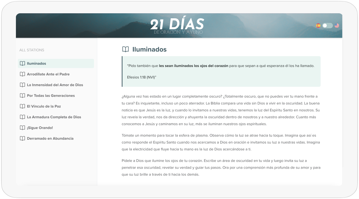
After

  • Implemented Next.js i18n routing for structured multilingual pages.

  • Added a visible language switcher available on every page.

  • Users can now switch languages instantly without breaking the flow.
  •  
Before After
Let’s Collaborate

Got a project?

We’re a team of creatives who are excited about unique ideas and help fin-tech companies to create amazing identity by crafting top-notch UI/UX.
Back
Preloader image